
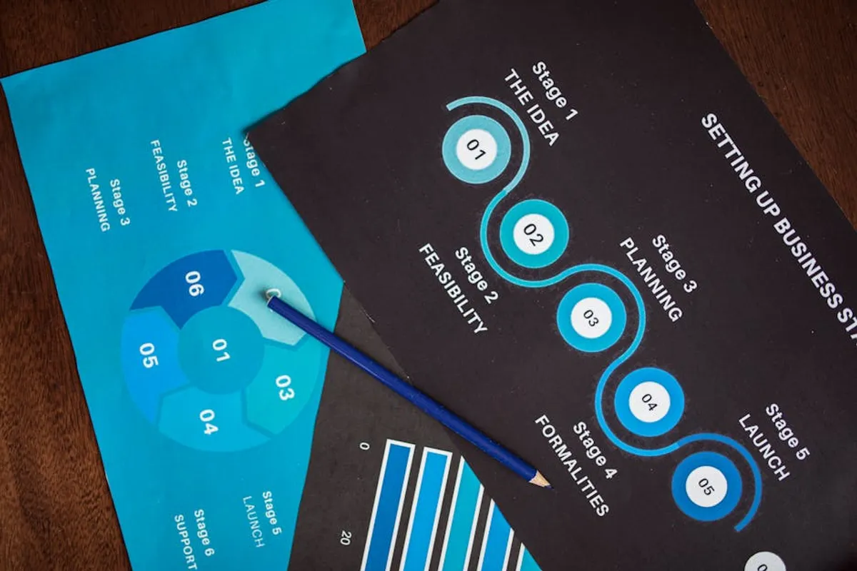
Creating compelling visual content is no longer optional for websites aiming to capture and retain audience attention. Infographics, in particular, excel at communicating complex information efficiently, driving engagement, and improving content shareability. However, not every marketer or content creator possesses advanced graphic design skills or access to specialized software. This is where infographic templates become indispensable, democratizing visual content creation by providing pre-designed structures that streamline the process. Understanding the current web design trends can help ensure your infographics are not only informative but also visually appealing and modern.
The right template can transform raw data and concepts into professional-grade visuals, saving significant time and resources. The challenge lies in selecting templates that not only look appealing but also align with your brand identity, cater to your specific data visualization needs, and integrate seamlessly into your website's content strategy. This selection requires a clear understanding of your objectives, audience, and the technical capabilities of various platforms.
Key Considerations When Selecting Infographic Templates
Before diving into specific platforms, evaluate templates based on several critical factors to ensure they meet your operational and aesthetic requirements:
- Customization Depth: Assess how much you can alter beyond text and basic colors. Can you change layouts, add custom fonts, upload brand assets, or adjust data visualization elements like chart types and axes? Limited customization can lead to generic-looking content.
- Data Visualization Capabilities: Determine if the templates support the types of data you need to present. Look for options beyond simple bar and pie charts, such as flowcharts, timelines, maps, or hierarchical structures, especially if your content is data-heavy.
- Ease of Use and Learning Curve: Consider the platform's interface. Is it intuitive for non-designers? A steep learning curve can negate the time-saving benefits of using templates. Drag-and-drop functionality and clear navigation are key.
- Export and Integration Options: Check supported export formats (JPG, PNG, PDF, SVG, GIF, MP4). Can you embed interactive infographics directly into your website? Compatibility with content management systems or social media platforms is also important.
- Template Library Size and Diversity: A larger library offers more stylistic choices and functional layouts, reducing the likelihood of your infographics looking identical to competitors'. Look for templates across various categories like statistics, processes, timelines, and comparisons.
- Branding Features: Can you easily apply your brand's color palette, typography, and logo consistently across all designs? Some platforms offer brand kit functionalities to enforce consistency.
- Licensing and Usage Rights: Understand the terms for commercial use of templates and assets. Ensure you have the necessary rights to publish the created infographics on your website and other marketing channels.
- Collaboration Features: If multiple team members will contribute, look for platforms that support real-time collaboration, commenting, and version control.
1. Canva
Canva has established itself as a dominant force in accessible graphic design, offering a vast repository of infographic templates suitable for diverse applications. Its drag-and-drop interface significantly lowers the barrier to entry for users without formal design training. The platform provides a broad spectrum of template categories, from statistical breakdowns and process flows to timelines and geographical data visualizations, all designed for quick modification.
Best for: Marketers, small business owners, social media managers, and content creators who need to produce visually appealing infographics rapidly without extensive design software experience. It excels at general-purpose infographics for blogs, social media, and presentations.
Pros:
- Extensive template library with thousands of options across numerous styles and topics.
- Highly intuitive drag-and-drop editor, making customization straightforward for beginners.
- Robust free tier offering significant functionality, including a substantial template selection.
- Access to a large stock photo, icon, and illustration library directly within the editor.
- Team collaboration features facilitate design reviews and shared asset management.
- Multiple export options, including high-resolution PNG, JPG, and PDF.
Cons:
- Templates can sometimes appear generic if not customized extensively, leading to a recognizable "Canva look."
- Advanced data visualization tools, such as complex chart types or interactive elements, are less sophisticated compared to specialized platforms.
- The free version may limit access to premium templates, stock elements, and advanced branding features.
- While versatile, it may not offer the deep design control preferred by professional graphic designers.
Verdict: Canva is an excellent starting point for anyone needing to create engaging infographics quickly and affordably. Its ease of use and extensive library make it a go-to for general marketing content, though users with highly specific data visualization requirements might find its advanced charting capabilities somewhat limited.
2. Piktochart
Piktochart focuses specifically on infographic creation, offering a more structured approach to data visualization than general design tools. Its templates are designed with data presentation in mind, featuring a range of chart types, maps, and icon sets tailored for statistical and informational content. The platform balances user-friendliness with a stronger emphasis on data-driven visuals.
Best for: Businesses, educators, and non-profits that regularly produce data-heavy reports, presentations, or educational materials. Ideal for users who prioritize clear, structured data visualization over purely artistic freedom.
Pros:
- Templates are purpose-built for infographics, often incorporating best practices for data storytelling.
- Strong suite of data visualization tools, including a variety of charts, maps, and interactive elements.
- Ability to import data directly from Excel, Google Sheets, or CSV files for automated chart generation.
- Good balance between ease of use and granular control over visual elements.
- Offers templates for various formats, including reports, presentations, and printables, in addition to standard infographics.
- Branding kit functionality helps maintain visual consistency across designs.
Cons:
- The free tier is more restrictive than some competitors, limiting the number of projects and export quality.
- The overall aesthetic might be perceived as more functional than artistic, potentially less suited for highly stylized brand campaigns.
- The learning curve for mastering all data visualization features can be slightly steeper than with simpler drag-and-drop editors.
- Its template library, while high-quality, is not as expansive in sheer volume as broader design platforms.
Verdict: Piktochart is a solid choice for organizations prioritizing clear, accurate, and professional data presentation. Its dedicated focus on infographics ensures templates are well-suited for informational content, making it a reliable tool for data-driven communication.
3. Venngage
Venngage positions itself as an all-in-one infographic maker, providing a comprehensive collection of templates categorized by industry, purpose, and visual style. It caters to a wide range of users, from marketing professionals to HR departments, by offering specialized templates for reports, presentations, and even resumes. The platform emphasizes readability and professional aesthetics, with robust customization options.
Best for: Marketing teams, HR professionals, educators, and businesses requiring a diverse range of infographic types, including those for internal communications, academic reports, or complex data storytelling.
Pros:
- Extensive and well-categorized template library covering a broad array of use cases and industries.
- Strong focus on professional design and clear data presentation, with templates that look polished.
- Advanced charting options and the ability to import data directly from spreadsheets.
- Offers interactive infographic features for web embedding, enhancing engagement.
- Includes a brand kit to maintain consistent visual identity across all creations.
- Good collaborative features for team projects and feedback.
Cons:
- The free plan is quite limited, primarily serving as a trial with restricted features and export options.
- Pricing for premium plans can be higher than some general design tools, reflecting its specialized nature.
- Some users might find the interface slightly less intuitive than Canva for very quick, simple designs.
- The sheer volume of options can sometimes be overwhelming for new users.
Verdict: Venngage stands out for its specialized infographic capabilities and professional-grade templates. It's particularly valuable for organizations that frequently produce detailed, data-rich visuals and require advanced features like interactive elements and comprehensive branding tools.
4. Adobe Express
Adobe Express (formerly Adobe Spark) integrates a suite of design tools into a user-friendly platform, including robust infographic template options. Leveraging Adobe's design heritage, it offers aesthetically pleasing templates that are easily customizable through a simplified interface. It aims to make professional design accessible to a broader audience without requiring expertise in more complex Adobe software.
Best for: Individuals and small businesses already within the Adobe ecosystem, or those seeking templates with a polished, contemporary design aesthetic for social media, basic web content, and presentations.
Pros:
- Templates often feature modern, professional design aesthetics consistent with Adobe's reputation.
- Integration with Adobe Stock provides access to a vast library of high-quality images and assets.
- Intuitive drag-and-drop editor with a relatively gentle learning curve.
- Offers a free tier with a good selection of templates and basic editing features.
- Seamless integration with other Adobe products for subscribers.
- Strong mobile app functionality allows for design on the go.
Cons:
- While good for general infographics, its data visualization capabilities are not as deep as dedicated infographic makers.
- Some advanced customization options found in professional Adobe products are absent.
- The free tier includes Adobe Express branding on exported designs, which requires a paid plan to remove.
- The template library, while growing, may not be as extensive or specialized for infographics as Venngage or Piktochart.
Verdict: Adobe Express is a strong contender for users who appreciate professional design and seek a user-friendly tool for creating visually appealing, general-purpose infographics. It's particularly attractive for those already invested in Adobe's creative cloud services.
5. Visme
Visme is a versatile visual content creation platform that extends beyond infographics to presentations, documents, and videos. Its infographic templates are highly customizable, offering a wide array of design elements, data widgets, and interactive features. Visme emphasizes creating engaging and brand-consistent visuals, providing extensive control over design details.
Best for: Marketing agencies, larger businesses, and content teams that need a comprehensive tool for creating a variety of visual content types, including detailed and interactive infographics, with a strong focus on branding and data accuracy.
Pros:
- Extremely versatile platform supporting a broad range of visual content, not just infographics.
- Rich library of customizable infographic templates across many categories and styles.
- Advanced data visualization tools, including dynamic charts, maps, and data widgets that can be linked to live data.
- Offers interactive features for web-embedded infographics, such as pop-ups and animated elements.
- Robust brand kit features for maintaining consistent visual identity.
- Strong collaboration and team management tools.
Cons:
- The sheer number of features can lead to a steeper learning curve for new users.
- The free plan is limited in terms of storage, project count, and advanced features.
- Pricing for premium plans can be on the higher end, reflecting its comprehensive capabilities.
- Some users might find the interface less streamlined for very quick, simple designs compared to Canva.
Verdict: Visme is a powerful choice for organizations requiring a versatile and feature-rich platform for all their visual content needs, particularly for creating sophisticated, data-driven, and interactive infographics. Its depth of features makes it suitable for professional use cases.
6. Infogram
Infogram specializes in creating interactive charts, maps, and infographics, making it a go-to for data journalists, analysts, and anyone needing to present complex data dynamically. Its templates are designed to highlight data points effectively, offering a range of interactive elements that enhance user engagement when embedded on websites. The platform prioritizes data accuracy and clarity.
Best for: Data journalists, researchers, financial analysts, and businesses that frequently publish data-intensive reports and require interactive, embeddable infographics for web content.
Pros:
- Exceptional for interactive data visualization, including dynamic charts, maps, and dashboards.
- Templates are optimized for presenting complex datasets clearly and engagingly.
- Supports direct data import from various sources, including spreadsheets and databases.
- Infographics can be easily embedded on websites, with responsive design for different devices.
- Offers a wide array of chart types and customization options for data elements.
- Good for creating live data dashboards that update automatically.
Cons:
- The design flexibility for non-data elements (e.g., illustrations, complex layouts) is less extensive than general design tools.
- The free plan has significant limitations on project count, privacy, and interactive features.
- The primary focus on data can make it less suitable for purely illustrative or conceptual infographics.
- The learning curve for maximizing interactive features can be higher for beginners.
Verdict: Infogram is the premier choice for creating data-rich, interactive infographics. Its specialized tools and templates are ideal for users whose core requirement is to present complex numerical information in an engaging and dynamic web-friendly format.
7. VistaCreate (formerly Crello)
VistaCreate is a graphic design platform offering a broad array of templates, including a dedicated section for infographics. It focuses on providing creative assets and easy-to-use editing tools for social media content, marketing materials, and web visuals. Its infographic templates are generally vibrant and modern, suitable for catching attention on digital platforms.
Best for: Social media marketers, bloggers, and small businesses looking for trendy, visually appealing infographic templates that are quick to customize and publish across various digital channels.
Pros:
- User-friendly interface with drag-and-drop functionality.
- Large library of templates, photos, videos, and animation assets.
- Offers a good selection of modern and visually appealing infographic templates.
- Includes a free plan with a decent range of features and assets.
- Supports various output formats, including animated designs.
- Good for creating infographics with a strong visual impact for social media sharing.
Cons:
- Data visualization capabilities are more basic compared to specialized infographic tools.
- Templates might be more geared towards general visual appeal rather than deep data storytelling.
- Some unique or advanced design elements are locked behind the premium subscription.
- Less robust for complex, multi-page infographics or detailed reports.
Verdict: VistaCreate is a strong option for users prioritizing visual appeal and ease of use for social media and blog infographics. Its template library is well-suited for creating engaging, shareable content, though it may not be the best fit for highly complex data analysis.
8. Easil
Easil is a design platform that emphasizes brand consistency and template control, making it particularly useful for teams. Its infographic templates are designed to be "brand locked," meaning certain elements can be restricted from modification by team members, ensuring adherence to brand guidelines. The templates themselves are professionally designed and highly customizable within these parameters.
Best for: Marketing teams, agencies, and larger organizations that need to maintain strict brand consistency across all visual content, including infographics, while empowering multiple users to create designs.
Pros:
- Unique "brand lock" feature ensures adherence to brand guidelines, preventing off-brand designs.
- Professionally designed templates that are visually appealing and structured.
- Extensive stock image library and design assets available.
- Easy-to-use drag-and-drop editor suitable for non-designers.
- Good for creating a range of marketing collateral beyond just infographics.
- Offers team collaboration features and asset management.
Cons:
- The free tier is quite limited, primarily serving as a basic introduction to the platform.
- Pricing can be higher than some general design tools, reflecting its team-oriented features.
- While flexible, the "brand lock" feature might feel restrictive for individual creators who desire full design freedom.
- Data visualization tools are adequate but not as specialized or interactive as dedicated infographic platforms.
Verdict: Easil is an excellent choice for teams and organizations where brand consistency is paramount. Its template locking features and professional designs make it ideal for maintaining a cohesive visual identity across all marketing materials, including infographics.
9. Snappa
Snappa focuses on speed and simplicity, allowing users to create graphics, including infographics, quickly. Its template library is designed for rapid customization, featuring clean layouts and modern aesthetics. The platform aims to minimize the time spent on design, making it suitable for content creators with tight deadlines.
Best for: Bloggers, social media managers, and small businesses that need to produce high-quality, eye-catching infographics quickly and efficiently without getting bogged down in complex design software.
Pros:
- Extremely fast and intuitive interface for quick graphic creation.
- Templates are designed for easy customization and immediate impact.
- Access to a large library of stock photos, graphics, and fonts.
- Offers a free plan with a decent number of downloads per month.
- Good for creating infographics for social media, blog posts, and quick web content.
- No steep learning curve; users can start designing almost instantly.
Cons:
- The template library, while good, is not as extensive or specialized for complex infographics as some competitors.
- Data visualization capabilities are basic, primarily suitable for simple charts and statistics.
- Less suitable for highly detailed, multi-page infographics or interactive designs.
- Advanced branding features might be less comprehensive than platforms like Visme or Venngage.
Verdict: Snappa is ideal for users who prioritize speed and efficiency in creating visually appealing infographics for digital platforms. It's a strong tool for quick content generation, especially when advanced data visualization is not the primary requirement.
10. Google Slides / Microsoft PowerPoint
While not dedicated infographic makers, Google Slides and Microsoft PowerPoint offer surprisingly robust capabilities for creating custom infographics using their built-in shape tools, chart functions, and SmartArt graphics. Users can start from a blank canvas or adapt existing presentation templates. These tools benefit from widespread familiarity and integration into office ecosystems.
Best for: Users already proficient with these presentation software suites, those on a strict budget, or individuals needing to integrate infographics directly into existing presentations or documents without using external tools.
Pros:
- Widely accessible and often already included in existing software suites (e.g., Google Workspace, Microsoft 365).
- Familiar interface for most users, reducing the learning curve.
- Offers a good range of shape tools, icons, and charting options for custom design.
- Allows for deep customization and granular control over every element.
- Excellent for integrating infographics directly into presentations or reports.
- No additional cost if you already own or subscribe to the software.
Cons:
- No dedicated infographic templates; users must adapt presentation templates or build from scratch.
- Lacks specialized infographic features like interactive elements or advanced data widgets.
- Can be time-consuming to achieve a professional, polished look without design expertise.
- Limited export options for web-optimized images compared to dedicated design tools.
- Collaboration features are present but not as robust for graphic design as dedicated platforms.
Verdict: For users who are already adept with presentation software and have specific design ideas, Google Slides or PowerPoint can be surprisingly effective for creating custom infographics, especially when budget is a primary concern. However, they require more manual effort and design acumen than specialized template platforms.
11. Lucidchart
Lucidchart is primarily a diagramming and visual workspace tool, but its extensive library of templates includes options for flowcharts, process maps, and organizational charts, which can be adapted into informational infographics. It excels at illustrating relationships, sequences, and structures, making it valuable for technical or process-oriented content.
Best for: Technical content creators, project managers, and businesses that need to visualize processes, systems, or organizational structures within their infographics. Ideal for functional, diagram-heavy visuals.
Pros:
- Excellent for creating process-oriented and diagrammatic infographics.
- Extensive library of shapes, icons, and connectors for detailed visual representations.
- Strong collaboration features for real-time teamwork on complex diagrams.